mindmap
  root((Quick Data Exploration))
    1 - How big is the data?
    2 - How does the data look like?
    3 - What type of datatypes are found in the data?
    4 - Are there missing data in this dataset?
    5 - How does the data look mathematically?
    6 - Are there duplicate rows in this data?
    7 - What is the correlation between the columns in this data?
What is in my data?
According to Campusx-YouTube these are some of the suggested questions to answer when a new dataset is obtained.
Importing modules
import duckdb
import polars as pl
import seaborn as sn
import pandas as pd
import matplotlib.pyplot as plt
Reading data
# ts is in epoch time format so converting it to timestamp
# rounding values for temperature and humidity
# converting temperature from farhaneit to celsius

input_data_path = f"../data/iot/iot_telemetry_data.parquet"


df_raw = duckdb.sql(
    f"SELECT ts, to_timestamp(ts) AS timestamp, device, temp,ROUND((temp - 32) * 5.0 / 9, 4) AS temp_c, ROUND(humidity, 4) AS humidity, lpg, smoke, light FROM '{input_data_path}'"
)
Exploring the data
The seven questions to get insight into the data
How big is the data?
# Converting to polars to easy statistics and exploration
df_pl = df_raw.pl()
df_pl.shape
(405184, 9)How does the data look like?
df_pl.head()
shape: (5, 9)
| ts | timestamp | device | temp | temp_c | humidity | lpg | smoke | light |
|---|---|---|---|---|---|---|---|---|
| f64 | datetime[μs, Europe/Oslo] | str | f64 | f64 | f64 | f64 | f64 | bool |
| 1.5945e9 | 2020-07-12 02:01:34.385975 CEST | "b8:27:eb:bf:9d:51" | 22.7 | -5.1667 | 51.0 | 0.007651 | 0.020411 | false |
| 1.5945e9 | 2020-07-12 02:01:34.735568 CEST | "00:0f:00:70:91:0a" | 19.700001 | -6.8333 | 76.0 | 0.005114 | 0.013275 | false |
| 1.5945e9 | 2020-07-12 02:01:38.073573 CEST | "b8:27:eb:bf:9d:51" | 22.6 | -5.2222 | 50.9 | 0.007673 | 0.020475 | false |
| 1.5945e9 | 2020-07-12 02:01:39.589146 CEST | "1c:bf:ce:15:ec:4d" | 27.0 | -2.7778 | 76.8 | 0.007023 | 0.018628 | true |
| 1.5945e9 | 2020-07-12 02:01:41.761235 CEST | "b8:27:eb:bf:9d:51" | 22.6 | -5.2222 | 50.9 | 0.007664 | 0.020448 | false |
What type of datatypes are found in the data?
duckdb.sql("SUMMARIZE df_raw;")┌─────────────┬──────────────────────────┬───────────────────────────────┬───────────────────────────────┬───────────────┬───────────────────────────────┬───────────────────────┬───────────────────────────────┬───────────────────────────────┬───────────────────────────────┬────────┬─────────────────┐
│ column_name │ column_type │ min │ max │ approx_unique │ avg │ std │ q25 │ q50 │ q75 │ count │ null_percentage │
│ varchar │ varchar │ varchar │ varchar │ int64 │ varchar │ varchar │ varchar │ varchar │ varchar │ int64 │ decimal(9,2) │
├─────────────┼──────────────────────────┼───────────────────────────────┼───────────────────────────────┼───────────────┼───────────────────────────────┼───────────────────────┼───────────────────────────────┼───────────────────────────────┼───────────────────────────────┼────────┼─────────────────┤
│ ts │ DOUBLE │ 1594512094.3859746 │ 1595203417.2643125 │ 491304 │ 1594858017.2968097 │ 199498.39927628823 │ 1594686010.292624 │ 1594857972.1364734 │ 1595030547.7465725 │ 405184 │ 0.00 │
│ timestamp │ TIMESTAMP WITH TIME ZONE │ 2020-07-12 02:01:34.385975+02 │ 2020-07-20 02:03:37.264312+02 │ 326811 │ 2020-07-16 02:06:57.296824+02 │ NULL │ 2020-07-14 02:20:10.292624+02 │ 2020-07-16 02:06:12.136474+02 │ 2020-07-18 02:02:27.746572+02 │ 405184 │ 0.00 │
│ device │ VARCHAR │ 00:0f:00:70:91:0a │ b8:27:eb:bf:9d:51 │ 3 │ NULL │ NULL │ NULL │ NULL │ NULL │ 405184 │ 0.00 │
│ temp │ DOUBLE │ 0.0 │ 30.600000381469727 │ 287 │ 22.453987345644748 │ 2.698346951263289 │ 19.888040295855575 │ 22.243208182088022 │ 23.516330668892394 │ 405184 │ 0.00 │
│ temp_c │ DOUBLE │ -17.7778 │ -0.7778 │ 235 │ -5.303340377703994 │ 1.4990816816561081 │ -6.728858088985643 │ -5.417193168388082 │ -4.713166284527654 │ 405184 │ 0.00 │
│ humidity │ DOUBLE │ 1.1 │ 99.9 │ 626 │ 60.51169394645508 │ 11.366489374741377 │ 51.025250291852586 │ 54.94414996066462 │ 74.2764440390179 │ 405184 │ 0.00 │
│ lpg │ DOUBLE │ 0.002693478622661808 │ 0.016567377162503137 │ 8188 │ 0.007237125655057899 │ 0.001444115678768443 │ 0.006458547423805879 │ 0.007470350246685729 │ 0.00814041627569619 │ 405184 │ 0.00 │
│ smoke │ DOUBLE │ 0.006692096317386558 │ 0.04659011562630793 │ 6997 │ 0.019263611784848263 │ 0.0040861300601221845 │ 0.017032583919261386 │ 0.019897415643395536 │ 0.021809493412627078 │ 405184 │ 0.00 │
│ light │ BOOLEAN │ false │ true │ 2 │ NULL │ NULL │ NULL │ NULL │ NULL │ 405184 │ 0.00 │
└─────────────┴──────────────────────────┴───────────────────────────────┴───────────────────────────────┴───────────────┴───────────────────────────────┴───────────────────────┴───────────────────────────────┴───────────────────────────────┴───────────────────────────────┴────────┴─────────────────┘Are there missing data in this dataset?
This dataset is quiet clean, there are no missing data in the input data in any feature. Docs Reference
df_pl.null_count()
shape: (1, 9)
| ts | timestamp | device | temp | temp_c | humidity | lpg | smoke | light |
|---|---|---|---|---|---|---|---|---|
| u32 | u32 | u32 | u32 | u32 | u32 | u32 | u32 | u32 |
| 0 | 0 | 0 | 0 | 0 | 0 | 0 | 0 | 0 |
How does the data look mathematically?
df_pl.describe()
shape: (9, 10)
| statistic | ts | timestamp | device | temp | temp_c | humidity | lpg | smoke | light |
|---|---|---|---|---|---|---|---|---|---|
| str | f64 | str | str | f64 | f64 | f64 | f64 | f64 | f64 |
| "count" | 405184.0 | "405184" | "405184" | 405184.0 | 405184.0 | 405184.0 | 405184.0 | 405184.0 | 405184.0 |
| "null_count" | 0.0 | "0" | "0" | 0.0 | 0.0 | 0.0 | 0.0 | 0.0 | 0.0 |
| "mean" | 1.5949e9 | "2020-07-16 02:06:57.296824+02:… | null | 22.453987 | -5.30334 | 60.511694 | 0.007237 | 0.019264 | 0.277718 |
| "std" | 199498.399262 | null | null | 2.698347 | 1.499082 | 11.366489 | 0.001444 | 0.004086 | null |
| "min" | 1.5945e9 | "2020-07-12 02:01:34.385975+02:… | "00:0f:00:70:91:0a" | 0.0 | -17.7778 | 1.1 | 0.002693 | 0.006692 | 0.0 |
| "25%" | 1.5947e9 | "2020-07-14 02:20:00.478589+02:… | null | 19.9 | -6.7222 | 51.0 | 0.006456 | 0.017024 | null |
| "50%" | 1.5949e9 | "2020-07-16 02:06:28.940644+02:… | null | 22.2 | -5.4444 | 54.9 | 0.007489 | 0.01995 | null |
| "75%" | 1.5950e9 | "2020-07-18 02:02:56.634962+02:… | null | 23.6 | -4.6667 | 74.3 | 0.00815 | 0.021838 | null |
| "max" | 1.5952e9 | "2020-07-20 02:03:37.264312+02:… | "b8:27:eb:bf:9d:51" | 30.6 | -0.7778 | 99.9 | 0.016567 | 0.04659 | 1.0 |
Are there duplicate rows in this data?
Although the below script shows there are duplicates, it looks like polars and pandas work differently here so it is important to check both. While polars returns all occurances of the duplicate, pandas only gets the duplicated values. Hence polars shows the shape to be (26,8) while pandas returns 13 duplicated rows in this dataset
dup_mask = df_pl.is_duplicated()
duplicates = df_pl.filter(dup_mask)  # Filter to show duplicated rows only

df_pd = df_pl.to_pandas().duplicated().sum() # from pandas
df_pd
duplicates  # from polars
np.int64(13)
shape: (26, 9)
| ts | timestamp | device | temp | temp_c | humidity | lpg | smoke | light |
|---|---|---|---|---|---|---|---|---|
| f64 | datetime[μs, Europe/Oslo] | str | f64 | f64 | f64 | f64 | f64 | bool |
| 1.5945e9 | 2020-07-12 10:32:27.272352 CEST | "1c:bf:ce:15:ec:4d" | 24.700001 | -4.0556 | 74.2 | 0.006644 | 0.017556 | true |
| 1.5945e9 | 2020-07-12 10:32:27.272352 CEST | "1c:bf:ce:15:ec:4d" | 24.700001 | -4.0556 | 74.2 | 0.006644 | 0.017556 | true |
| 1.5947e9 | 2020-07-13 17:02:04.678796 CEST | "1c:bf:ce:15:ec:4d" | 23.700001 | -4.6111 | 61.7 | 0.006916 | 0.018325 | true |
| 1.5947e9 | 2020-07-13 17:02:04.678796 CEST | "1c:bf:ce:15:ec:4d" | 23.700001 | -4.6111 | 61.7 | 0.006916 | 0.018325 | true |
| 1.5948e9 | 2020-07-15 00:14:33.272537 CEST | "b8:27:eb:bf:9d:51" | 22.6 | -5.2222 | 48.6 | 0.008071 | 0.02161 | false |
| … | … | … | … | … | … | … | … | … |
| 1.5951e9 | 2020-07-18 16:50:31.409988 CEST | "b8:27:eb:bf:9d:51" | 21.5 | -5.8333 | 51.9 | 0.008912 | 0.024024 | false |
| 1.5951e9 | 2020-07-19 02:01:15.810328 CEST | "b8:27:eb:bf:9d:51" | 22.6 | -5.2222 | 52.1 | 0.008822 | 0.023765 | false |
| 1.5951e9 | 2020-07-19 02:01:15.810328 CEST | "b8:27:eb:bf:9d:51" | 22.6 | -5.2222 | 52.1 | 0.008822 | 0.023765 | false |
| 1.5951e9 | 2020-07-19 05:54:33.955044 CEST | "b8:27:eb:bf:9d:51" | 22.4 | -5.3333 | 50.8 | 0.008671 | 0.02333 | false |
| 1.5951e9 | 2020-07-19 05:54:33.955044 CEST | "b8:27:eb:bf:9d:51" | 22.4 | -5.3333 | 50.8 | 0.008671 | 0.02333 | false |
What is the correlation between the columns in this data?
We need to use pandas here as the .corr() function in pandas provides a more readable table for inspecting correlation
# Select only numeric columns for the correlation matrix
numeric_df = df_pl.select(pl.col(pl.Float64 or pl.Int64))
numeric_df.to_pandas().corr(method='pearson')
numeric_df.to_pandas().corr(method='spearman')
numeric_df.to_pandas().corr(method='kendall')| ts | temp | temp_c | humidity | lpg | smoke | |
|---|---|---|---|---|---|---|
| ts | 1.000000 | 0.074443 | 0.074442 | 0.017752 | 0.014178 | 0.016349 |
| temp | 0.074443 | 1.000000 | 1.000000 | -0.410427 | 0.136396 | 0.131891 |
| temp_c | 0.074442 | 1.000000 | 1.000000 | -0.410427 | 0.136397 | 0.131891 |
| humidity | 0.017752 | -0.410427 | -0.410427 | 1.000000 | -0.672113 | -0.669863 |
| lpg | 0.014178 | 0.136396 | 0.136397 | -0.672113 | 1.000000 | 0.999916 |
| smoke | 0.016349 | 0.131891 | 0.131891 | -0.669863 | 0.999916 | 1.000000 |
| ts | temp | temp_c | humidity | lpg | smoke | |
|---|---|---|---|---|---|---|
| ts | 1.000000 | 0.055377 | 0.055408 | 0.051560 | 0.077576 | 0.077576 |
| temp | 0.055377 | 1.000000 | 0.999994 | -0.334051 | 0.121469 | 0.121469 |
| temp_c | 0.055408 | 0.999994 | 1.000000 | -0.334268 | 0.121609 | 0.121609 |
| humidity | 0.051560 | -0.334051 | -0.334268 | 1.000000 | -0.764612 | -0.764612 |
| lpg | 0.077576 | 0.121469 | 0.121609 | -0.764612 | 1.000000 | 1.000000 |
| smoke | 0.077576 | 0.121469 | 0.121609 | -0.764612 | 1.000000 | 1.000000 |
| ts | temp | temp_c | humidity | lpg | smoke | |
|---|---|---|---|---|---|---|
| ts | 1.000000 | 0.035450 | 0.035481 | 0.030211 | 0.046115 | 0.046115 |
| temp | 0.035450 | 1.000000 | 0.999815 | -0.196422 | 0.037934 | 0.037934 |
| temp_c | 0.035481 | 0.999815 | 1.000000 | -0.196596 | 0.038080 | 0.038080 |
| humidity | 0.030211 | -0.196422 | -0.196596 | 1.000000 | -0.559969 | -0.559969 |
| lpg | 0.046115 | 0.037934 | 0.038080 | -0.559969 | 1.000000 | 1.000000 |
| smoke | 0.046115 | 0.037934 | 0.038080 | -0.559969 | 1.000000 | 1.000000 |
Exploratory data analysis (EDA)
mindmap
  root((EDA))
    **Univariate data analysis** <br>Independent analysis of individual columns of the dataset.
    **Bivariate data analysis** <br> Pairwise analysis of two columns of the dataset.
    **Multivariate data analysis**<br> Simultaneously analysis of two or more columns.
Univariate data analysis
Handling categorial data
Countplot
Count plots provide the unique values of the column and their frequency of occurance. This provides a understanding on how the data is spread across the classes / categories of the
sn.countplot(df_pl.select(pl.col('device')), x='device')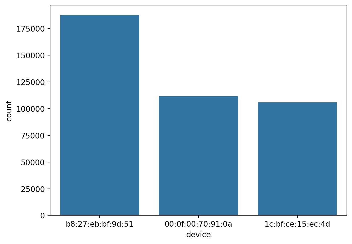
PieChart
A PieChart can be customized to show both the count of categories and their percentages in the dataset.
vc = df_pl.to_pandas()['device'].value_counts()
vc.plot(kind='pie', autopct=lambda pct: f'{int(round(pct * vc.sum() / 100))}\n({pct:.1f}%)')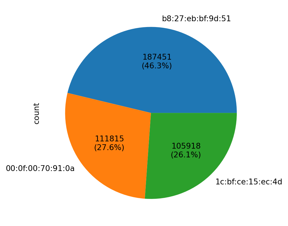
Handling numerical data
Histogram
Histogram is a way to visualize a frequency table. The datapoints can be binned to n number of bins.
sn.histplot(df_pl, x='humidity', bins=60)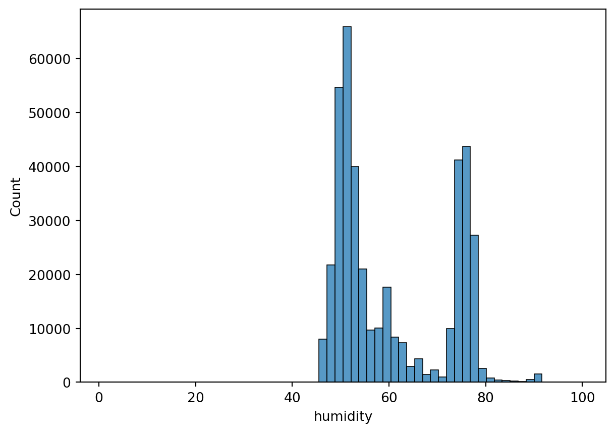
sn.histplot(df_pl, x='temp_c', bins=60)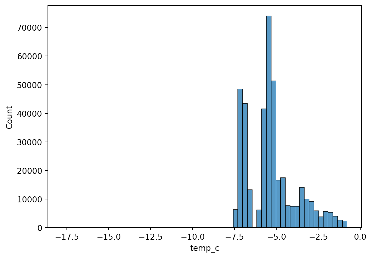
Distplot
Density plots show the distribution of the data values as a continuous line. It is a smoothed version of a histogram and is calculated via a kernel density estimate (page 24 - Practical Statistics for Data Scientists). The main difference between an histogram and a distplot is the y-axis scale. Displot uses probability scale and histogram uses frequency / count of observations.
sn.displot(df_pl, x='humidity', kind="kde")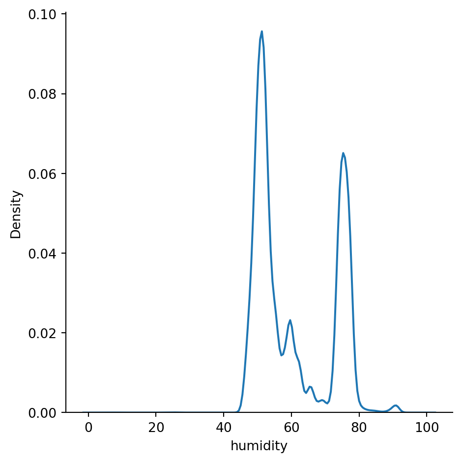
sn.displot(df_pl, x='temp_c', kind="kde")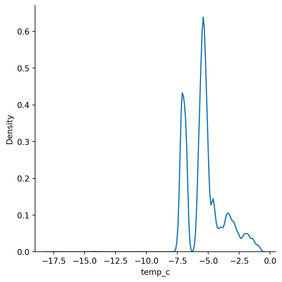
But remember our data has three different sensors. Would be great to ensure we can see the probablity density function of each one seperately. But this will fall in Bivariate data analysis, as we are using another column to make sense of the humidity or temp_c column.
sn.kdeplot(df_pl, x='humidity', hue='device')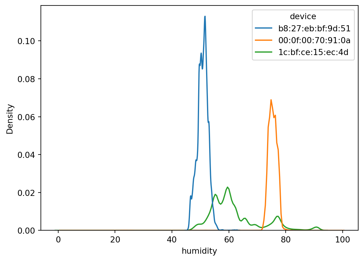
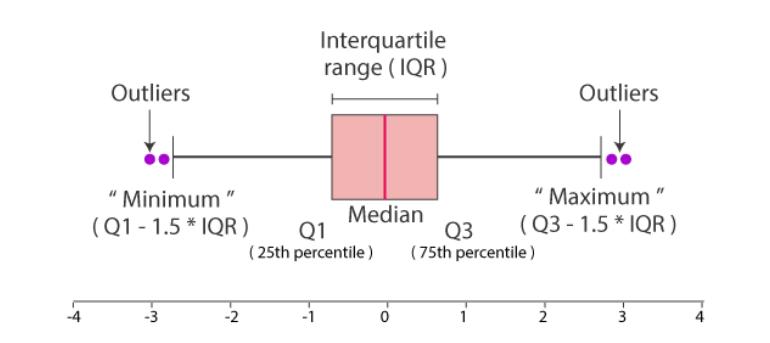
Boxplot
Boxplot give a quick way to visualize the distribution of data and provide boundaries to the observation outside which we find the outliers. It also shows the 25th percentile, median, 75th percentile.
The visual also helps quickly notice the outliers in the observations on both lower and higher boundries.
This is also called as a 5 point summary visual.
sn.boxplot(df_pl, x='humidity')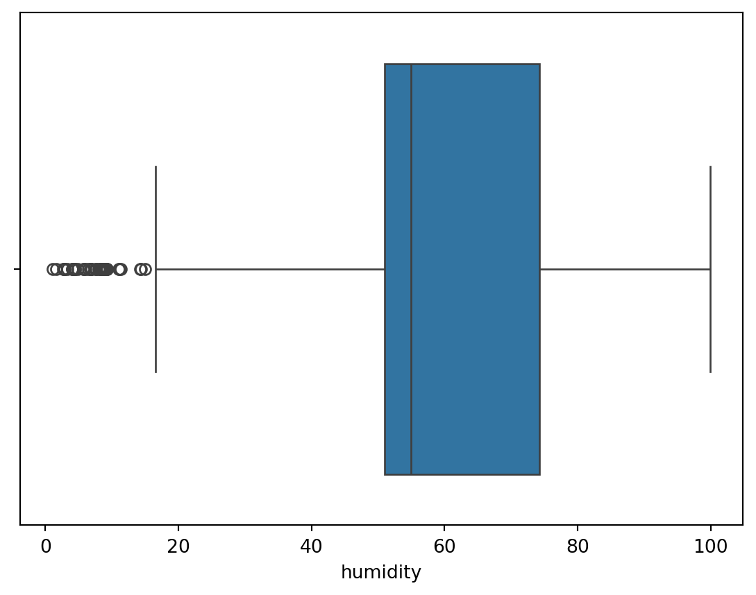
sn.boxplot(df_pl, x='temp_c')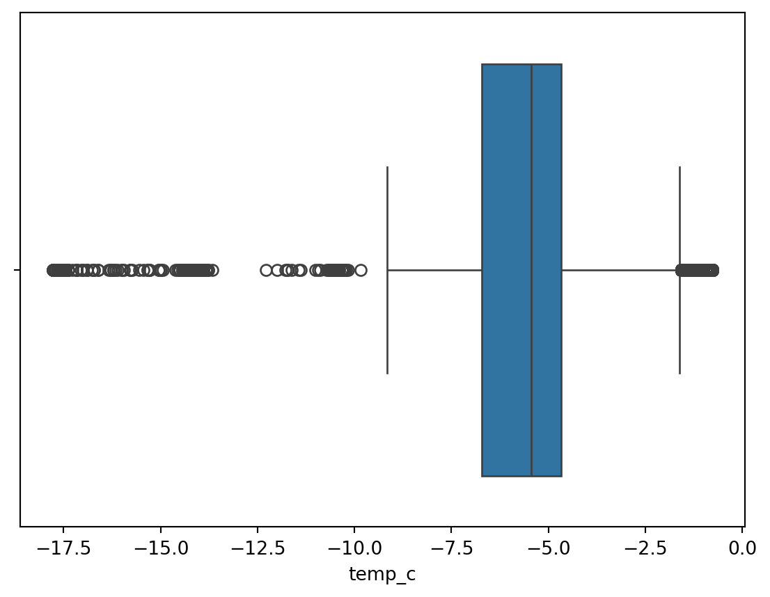
Bivariate data analysis
Scatterplot (Numerical to Numerical)
sn.scatterplot(df_pl, x='temp_c', y='humidity' )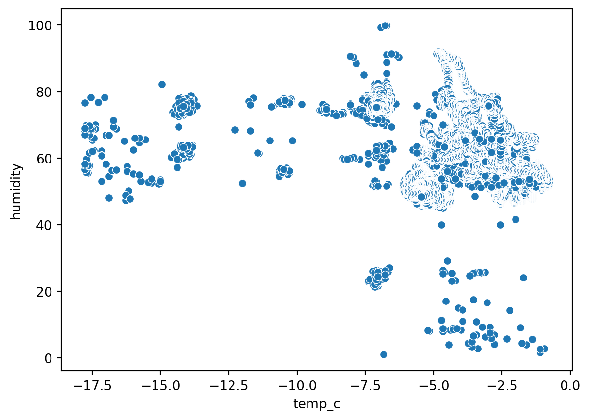
Barplot (Numerical to categorical)
sn.barplot(df_pl, x='temp_c', y='device')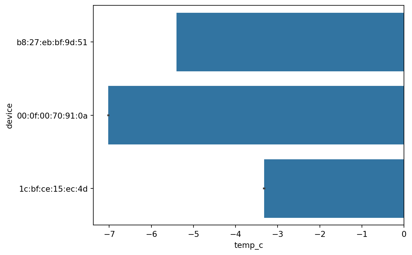
Boxplot (Numerical to categorical)
sn.boxplot(df_pl, x='temp_c', y='device')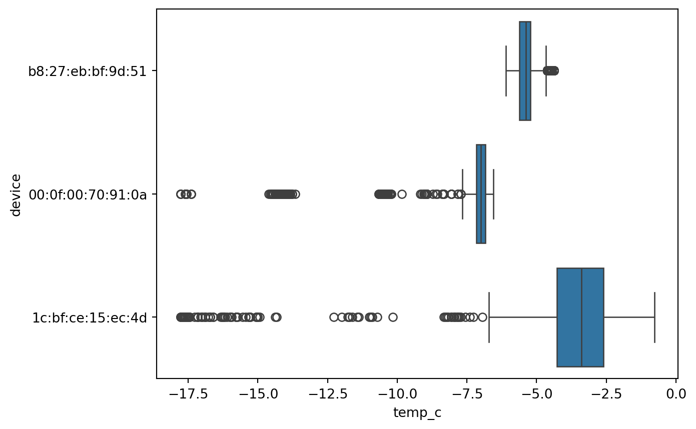
Multivariate data analysis
sn.scatterplot(df_pl, x='temp_c', y='humidity', hue='device' )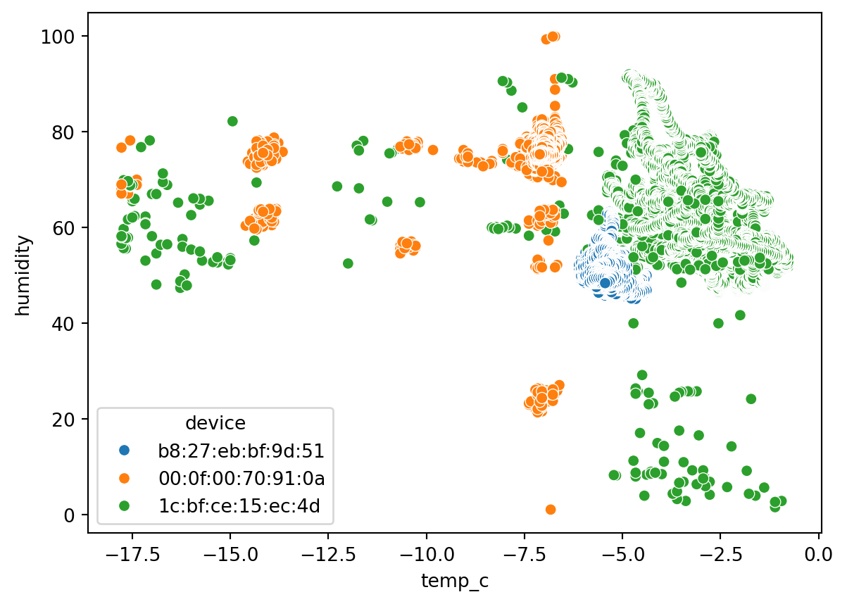
# Convert Polars DataFrame to pandas for seaborn plotting
df = df_pl.to_pandas()

# Get unique devices (you want 3 scatterplots, one for each device)
devices = df['device'].unique()

# Create a figure with 1 row and 3 columns for side-by-side plots
fig, axes = plt.subplots(1, 3, figsize=(18, 5), sharex=True, sharey=True)

# Loop through devices and axes to plot each device's scatterplot
for ax, device in zip(axes, devices):
    subset = df[df['device'] == device]
    sn.scatterplot(data=subset, x='temp_c', y='humidity', ax=ax)
    ax.set_title(f'Device: {device}')
    ax.set_xlabel('Temperature (°C)')
    ax.set_ylabel('Humidity')

plt.tight_layout()
plt.show()
Text(0.5, 1.0, 'Device: b8:27:eb:bf:9d:51')Text(0.5, 0, 'Temperature (°C)')Text(0, 0.5, 'Humidity')Text(0.5, 1.0, 'Device: 00:0f:00:70:91:0a')Text(0.5, 0, 'Temperature (°C)')Text(0, 0.5, 'Humidity')Text(0.5, 1.0, 'Device: 1c:bf:ce:15:ec:4d')Text(0.5, 0, 'Temperature (°C)')Text(0, 0.5, 'Humidity')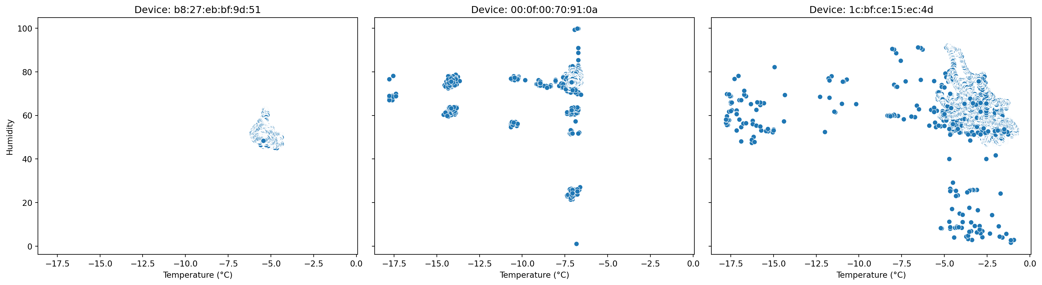
Automated EDA using pandas-profiling
This is a quick way to perform EDA and study the data. However, this only works on pandas dataframe. So if we have very large datasets, this approach may or may not be performant.
That said, this approach eliminates most of the hassle in understanding the input data.
It lacks in some visualization, which need to be performed to get a better idea of the data.
from ydata_profiling import ProfileReport
profile = ProfileReport(df_pl.to_pandas(), title="Data Profiling Report")
profile.to_notebook_iframe()